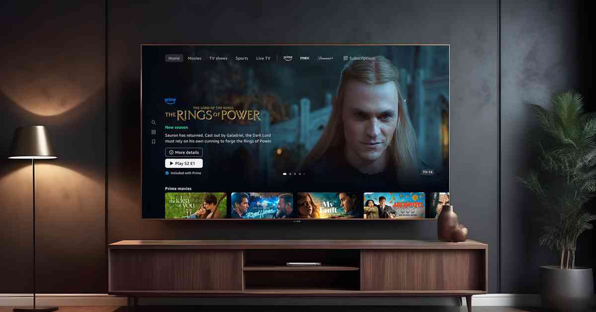
Amazon Prime Video has made some significant improvements to its interface to make it easier for members to navigate and find their favorite shows. The redesigned UI now includes a new tab specifically for content that is included with your Prime Video subscription, without any paid movies or series mixed in.
The new “Prime” tab can be found in the main navigation bar at the top of the screen, rather than on the left side. In addition to tabs for movies, TV shows, sports, and live TV, there are also tabs for other services that you may be subscribed to, such as Max, Crunchyroll, and Paramount Plus. If you don’t have any additional services linked to Prime, you will see a “subscriptions” tab with other services that you can sign up for.
As part of the redesign, Prime Video will now use AI to recommend titles in new “Made for you” collections on the movie and TV show tabs. These collections will feature titles that are tailored to your interests, whether they are included with Prime or not. While Prime Video will still display movies available for rent or purchase, as well as TV series from services you do not subscribe to, the new layout is much more organized and the Prime tab provides a way to filter out content that is not included in your subscriptions.
Kam Keshmiri, Vice President of Design at Prime Video, stated that they are always listening to customer feedback and looking for ways to improve the streaming experience. It is clear that many customers are in search of a more intuitive interface, and the new changes aim to address this need.
Amazon is not the only streaming service making changes to its interface; Netflix has also announced that it is experimenting with a new homepage to simplify the streaming experience. By continually updating and enhancing their platforms, streaming services are working to provide users with a more user-friendly and personalized viewing experience.


